Timing Diagrams

ADC Timing
I have recently been working as part of a team generating some custom silicon for a high speed time of flight LIDAR. The digital logic is very simple but its important to get this correct. The team has several different groups all working remotely which makes clear documentation worth the effort. Timing diagrams for a system that can be understood by a wide audience is an art form; displaying data in a understandable and information dense way is subtle. The work of Edward Tufte is wonderful to look into on this topic, one of the historic pieces of data visualization he references is Charles-Joseph Minard’s piece on Napolean’s invasion of Russia:
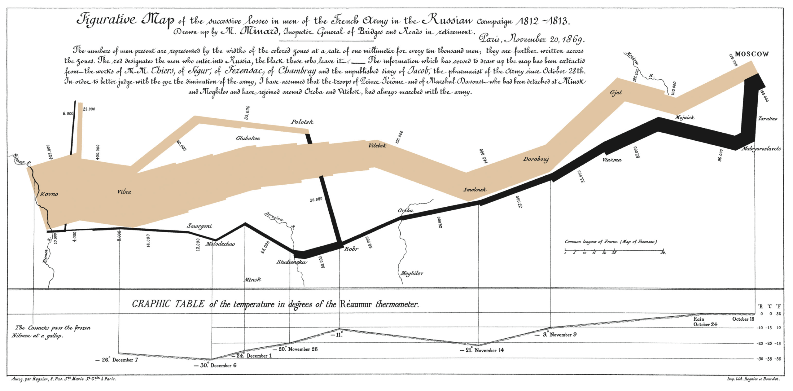
Edward Tufte’s English translation of Charles Minard's "Carte figurative des pertes successives en hommes de l'Armée Française dans la campagne de Russie 1812–1813". From Beautiful Evidence.
Clearly expectations are high here. These diagrams should be useful to everyone working on the part, not only to the digital designers. Hopefully the improved documentation keeps the casualties down.
Generating Timing Diagrams
I find that there are four starting points for timing diagrams
- Documenting an existing device
- If you have an existing device it may be best to observe the behavior you’re describing with a logic analyzer directly. A tool like Sigrok+PulseView will allow you to generate a wave file or a timing diagram directly.
- Documenting an existing logic design
- Simulate and plot.
- Designing
- If the logic is simple and easiest to express through RTL or software then a simulation is likely the best option. This is easy to over do and should be done only if the relation of the signals is already well known (SPI communication or a rollover counter as an example).
- If the design is subtle then the best starting point may be to first document the timing. This will help with the verification and testing as the requirements are expressed in the timing diagrams.
- Starting from a paper diagram I find to be the most productive approach. A graph paper notebook makes an excellent starting point for design. This leaves all the tool details separate from the actual design.
- Replicating an existing timing diagram
- Use WaveDROM or similar
In this case I was documenting an existing design that was not modeled in HDL. I wrote the verilog that would produce the timing plots I was given, wrote a couple test benches, and simulated it using Verilator. The results are stored in a vcd file. A faster solution would have been to use a program like WaveDROM. I had a rough timing diagram, the only required task was improving the plots. There’s a Hackaday article that introduces the tool, more information is below in the tool comparison. Simulating the design is more information dense, it is not just a visualization.
Here are the two different approaches, both are useful methods.
Matplotlib + vcdvcd Timing Diagram Plots
VCD is a straight forward ascii format for storing digital outputs. The following loads a VCD using vcdvcd and plots it using matplotlib.
I then forked vcdvcd to my fork and added a couple of plotting features. This approach was great for density of information. I only needed to change the testbench to produce all the examples I needed. All the plotting tricks can be done with the powerful plotting tools in the Python world. This can be done using other visualization tools and wave file viewers (some are listed below) but there’s a tradeoff of customizability and complexity. This approach naturally fits into a workflow using a jupyter notebook as the living design document. This technique allows the living design document to be fully executable, morphing into the user manual and delivery documentation.
The following Python script loads a VCD trace and generates a labeled timing diagram using Matplotlib. It uses a modified version of vcdvcd that supports direct plotting.
import vcdvcd
import matplotlib.pyplot as plt
import numpy as np
from dataclasses import dataclass

def condition_expand(signal, endtime: float):
    """Condition and expand VCD signal to endtime."""
    signal.tv = vcdvcd.condition_signal_tv(signal.tv)
    x, y = list(zip(*signal.tv))
    x, y = vcdvcd.expand_signal(x, y, endtime)
    return np.array(x, dtype=float), np.array(y, dtype=float)

@dataclass
class Signal:
    title: str
    x: np.array
    y: np.array
    xscale: float
    endtime: float

    @classmethod
    def load(cls, vcd: vcdvcd.VCDVCD, signal_id: str, title: str, endtime: float):
        xscale = float(vcd.timescale["timescale"])
        x, y = condition_expand(vcd[signal_id], endtime)
        return cls(title=title, x=np.asarray(x), y=np.asarray(y), xscale=xscale, endtime=endtime)

def get_signals(fname="vlt_dump.vcd"):
    vcd = vcdvcd.VCDVCD(fname)
    signal_tags = (("TOP.signal_in[11:0]","AIN"),
        ("TOP.clk", "CLK"),
        ("TOP.enable", "EN"),
        ("TOP.data_out[11:0]", "ADCOUT"))

    endtime = max(vcd[name].endtime for name, _ in signal_tags)

    signals: List[Signal] = [
        Signal.load(vcd=vcd, signal_id=signal_id, title=title, endtime=endtime)
        for signal_id, title in signal_tags]
    return signals

def plot_timing_diagram(signals):
    '''
    Normalize signals and space them out on one axis.
    '''
    fig, ax = plt.subplots(figsize=(12, 6))
    spacing = 2.2

    # Digital signals
    for i, signal in enumerate(signals):
        y_offset = -i * spacing
        endtime = signal.endtime
        xscale = signal.xscale
        x = signal.x*xscale*1e9

        y_range = (max(signal.y)-min(signal.y))
        y = np.zeros_like(signal.y) if y_range == 0 else signal.y/y_range

        label = signal.title

        # Normalize: each digital waveform ranges from baseline (y_offset) to y_offset+1
        ax.step(x, y_offset + y, where="post", color="black", lw=1.5)
        ax.hlines(y_offset, 0, endtime * xscale, color="0.8",
                  lw=0.5, linestyle="--")  # baseline
        ax.text(-1, y_offset + 0.5, label, ha="right", va="center",
                fontsize=12, weight="bold")
        y_offset -= spacing

    # Formatting
    ax.set_ylim(-spacing*(len(signals)-1) - spacing/2, spacing)
    ax.set_xlabel("Time (ns)", fontsize=12)
    ax.set_yticks([])
    ax.set_title("Pipelined ADC Timing Diagram", fontsize=14, weight="bold")

    # Gridlines
    ax.xaxis.set_major_locator(plt.MultipleLocator(5))
    ax.xaxis.set_minor_locator(plt.MultipleLocator(1))
    ax.grid(axis="x", which="major", linestyle=":", color="0.7")

    # Example timing annotations (positioned relative to digital baselines)
    valid_data_x = 23.
    annotate_arrow(ax, 11, valid_data_x, -5.25, "Pipeline delay")

    # Vertical event marker
    ax.axvline(valid_data_x, color="black", linestyle="--", lw=1.0)

    return fig, [ax]

signals = get_signals()
fig, axes = plot_timing_diagram(list(signals))
axes[0].set_xlim(0, 50)
fig.savefig("adc_timing_model.svg", bbox_inches="tight")
plt.show()

A WaveDROM visualization rendered using the python library. This can be done with wavedrom-cli but I don’t use nodejs often so the python library fits into my workflow better. This can also also be done using the web editor or the command line tool (just not neatly in a jupyter notebook).
import wavedrom
st = '''
{ "signal": [
  { "name": "Analog Signal In", "wave": "z================", "data":["D0", "D1", "D2", "D3", "D4", "D5", "D6", "D7", "D8", "D9", "D10", "D11", "D12", "D13", "D14", "D15", "D16", "D17", "D18", "D19"]},
  { "name": "Clock", "wave": "|n..............."},
  { "name": "Enable",       "wave": "0....1..........."},
  { "name": "ADC Data Out", "wave": "|1.........======", "data":["D4", "D5", "D6", "D7", "D8", "D9", "D10", "D11", "D12", "D13"]},
]}
'''
svg = wavedrom.render(st)
svg.saveas("adc_timing_model_wavedrom.svg")
The signal “wave”: “z===============” syntax uses WaveDROM’s custom wave symbols (e.g., = for a held high value). Refer to WaveDROM syntax guide for a full reference.
My preference is to use WaveDROM when making quick documentation and to write the HDL, simulate it, and plot when moving forward with the design. A tool that uses vcdvcd or similar to generate WaveDROM JSON would be useful, that would tie those workflows together.
Tool Overview
vcd2wavedrom
- Python based command line tool to generate a WaveDROM JSON file from a VCD.
- I had parsing issues with the signals I was using, this probably needs some extension to be able to parse a generic VCD. A version that uses the vcdvcd parser would be useful.
Articles & Resources
WaveDROM
- Generate timing diagrams from a very concise JSON format. Seems to be the most popular method of autogenerating timing diagrams.

Articles & Resources
- Source: https://github.com/wavedrom/wavedrom
- User Manual: https://wavedrom.com/images/SNUG2016_WaveDrom.pdf
- VCD Compiler: https://github.com/nanamake/vcd2json
- Articles:
- Videos:
- WebEditor: https://wavedrom.com/editor.html
- Examples:
SchemDraw
SchemDraw is a full circuit drawing library that includes a logic drawing suite forked from WaveDROM. The circuit drawing features are worth exploring on their own. The same VCD compiler can be used as with WaveDROM.
Articles & Resources
- Source: https://bitbucket.org/cdelker/schemdraw/src/master/
- Documentation: https://schemdraw.readthedocs.io/en/latest/index.html
- Articles
- Timing Section: https://schemdraw.readthedocs.io/en/latest/elements/timing.html
GTKWave
- Useful and simple waveform viewer, similar to older versions of the ModelSim viewer.
- I find this useful for exploring files but the visualization is rudimentary. Making documentation is best done using a different tool (for now at least).
GTKWave is excellent for debugging but limited for polished documentation due to its fixed layout and bitmap output.
Articles & Resources
- Source: https://github.com/gtkwave/gtkwave
- Documentation:
- Articles:
PulseView
 PulseView is the frontend for the Sigrok project which I have a post on this here.
It supports a wide range of input and output types so is a reasonable go to. The built in protocol parsers make this
useful for all varieties of development other than its intended use as a logic analyzer GUI.
PulseView is the frontend for the Sigrok project which I have a post on this here.
It supports a wide range of input and output types so is a reasonable go to. The built in protocol parsers make this
useful for all varieties of development other than its intended use as a logic analyzer GUI.
VCDRom
 Another project from WaveDROM is VCDRom which is a VCD (Value Change Dump) viewer in the browser. It only supports viewing with no high level features but its great at what its for.
- Source: https://github.com/wavedrom/vcdrom
- Web Interface: https://vc.drom.io/
Titz Timing
Interesting latex library that could be powerful. A compiler exists for it from VCD just like one exists to WaveDROM. Worth checking out if you have a background with latex or are already using it in a give system.
Articles & Resources
- User Manual: https://www.tug.org/texmf-dist/doc/latex/tikz-timing/tikz-timing.pdf
- VCD Compiler: https://github.com/ernstblecha/vcd2tikztiming
WaveMe
I haven’t tried this but it exists and looks promising.
- Documentation: https://waveme.weebly.com/
Summary
Whether you’re sketching a protocol or documenting silicon behavior, choosing the right timing diagram tool can save hours and improve communication across your team. WaveDROM and simulation each have their strengths—pick the one that fits your project’s scale and stage without getting too.
| Tool | Input Format(s) | Output Format(s) | Strengths | Limitations | Best Use Case |
|---|---|---|---|---|---|
| WaveDROM | JSON | SVG, PNG, HTML | Concise format, integrates well in web docs, portable, browser editor | Manual editing required unless auto-generated; limited analog support | Quick documentation, embedded diagrams |
| vcdvcd + Matplotlib | VCD | SVG, PNG, PDF | Full plotting control, integrates with Jupyter, supports analog signals | Requires Python skills; less compact format | Detailed diagrams from simulation/testbench |
| vcd2wavedrom | VCD | WaveDROM JSON | Bridges simulation and WaveDROM; CLI-based | Parsing is fragile on complex VCDs; limited maintenance | Auto-generating WaveDROM from simulation output |
| GTKWave | VCD, FST, LXT, etc. | Screen display, PDF | Fast, mature, interactive GUI; deep introspection of signals | Not designed for polished documentation output | Debugging HDL simulations |
| PulseView | Sigrok session files | Screen display | Broad hardware support, protocol decoders, user-friendly GUI | Limited export features; focused on real-world logic analyzer data | Capturing real signals and basic visualization |
| SchemDraw | Python script | SVG, PNG, PDF | Circuit + timing diagrams; LaTeX style drawing | Less intuitive than WaveDROM for timing; more verbose | Combining logic symbols and timing in documents |
| VCDRom | VCD | Browser display | No install needed; fast and simple viewer | View-only; minimal interactivity or customization | Quick online VCD viewing |
| TikZ-Timing | LaTeX script | Highly customizable, integrates with LaTeX | Steep learning curve; hard to preview | Academic papers, publication-quality diagrams | |
| WaveMe | GUI / Proprietary | Unknown (likely image) | User-friendly, WYSIWYG | Limited info online; may not be open source | Rapid interactive timing diagram creation |